Case 11 / 18
Vodafone
The challenge
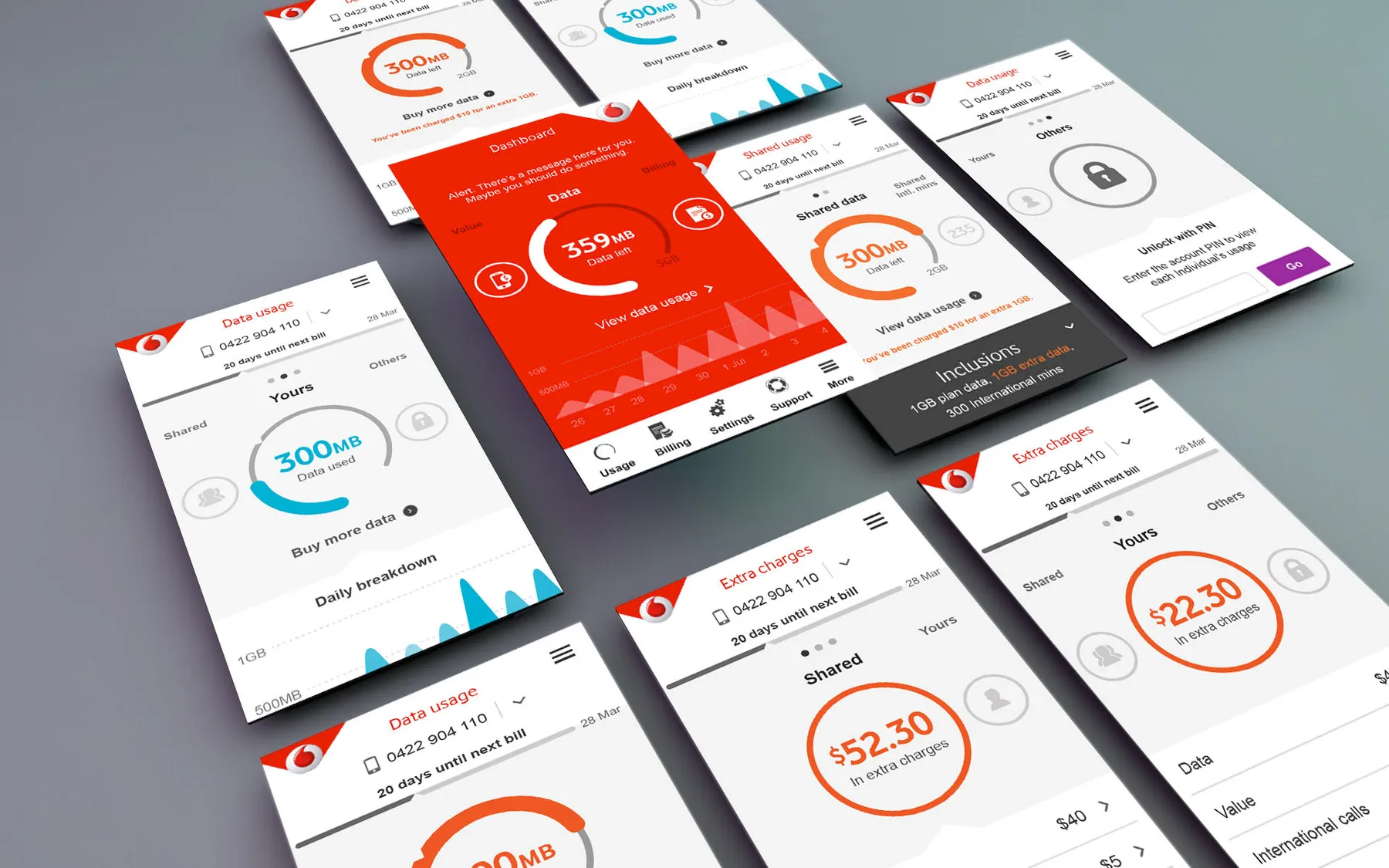
Vodafone Australia was bringing its digital experience in line with the latest global brand and UX guidelines. For paying customers, the My Vodafone app and its web equivalent were the heart of that experience, and they needed to feel modern, clear and consistent.
My role
I joined in the BAU team, mostly designing banners, and quickly moved into the My Vodafone business unit, which looked after existing customers. I worked in small agile teams and alongside departments outside digital, including retail and customer service.
The app home screen
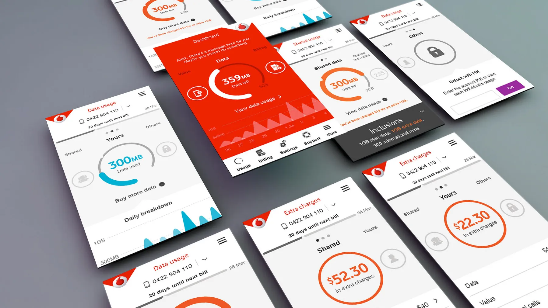
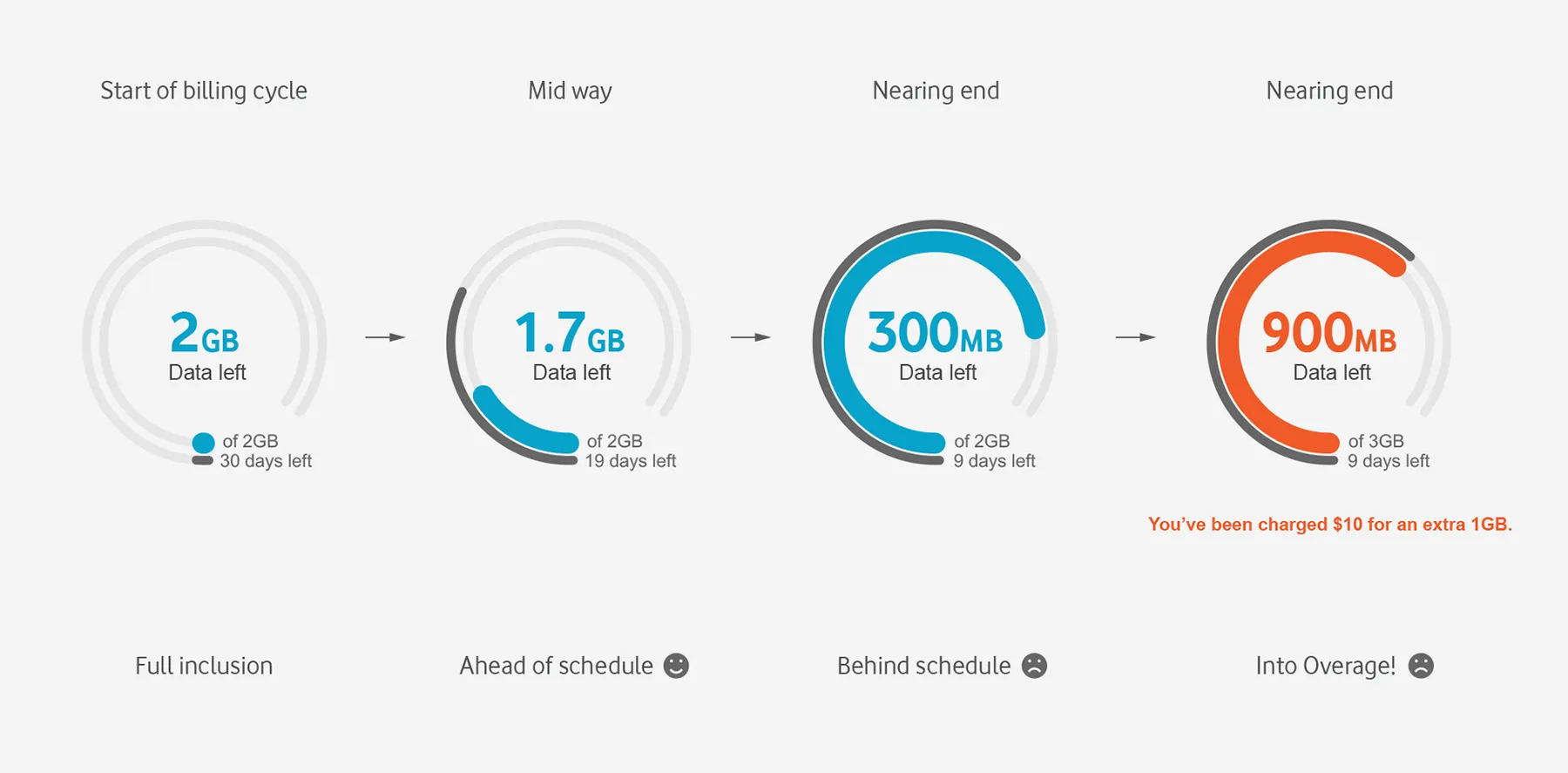
The home screen was our main focus. Usage dials tested very well with customers, so I spent a lot of time refining these complex graphics until they were clear at a glance.
End to end journeys
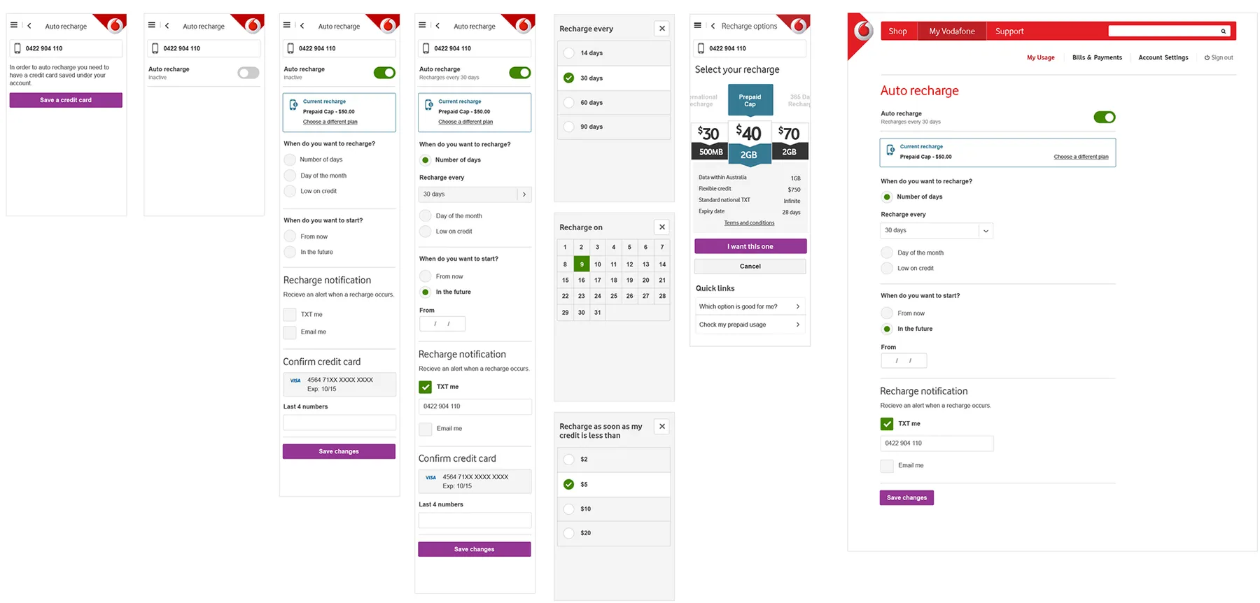
Most projects spanned many screens with complex interface elements. I built them from components in our style guide so the experience stayed consistent from one journey to the next.
Support concepts
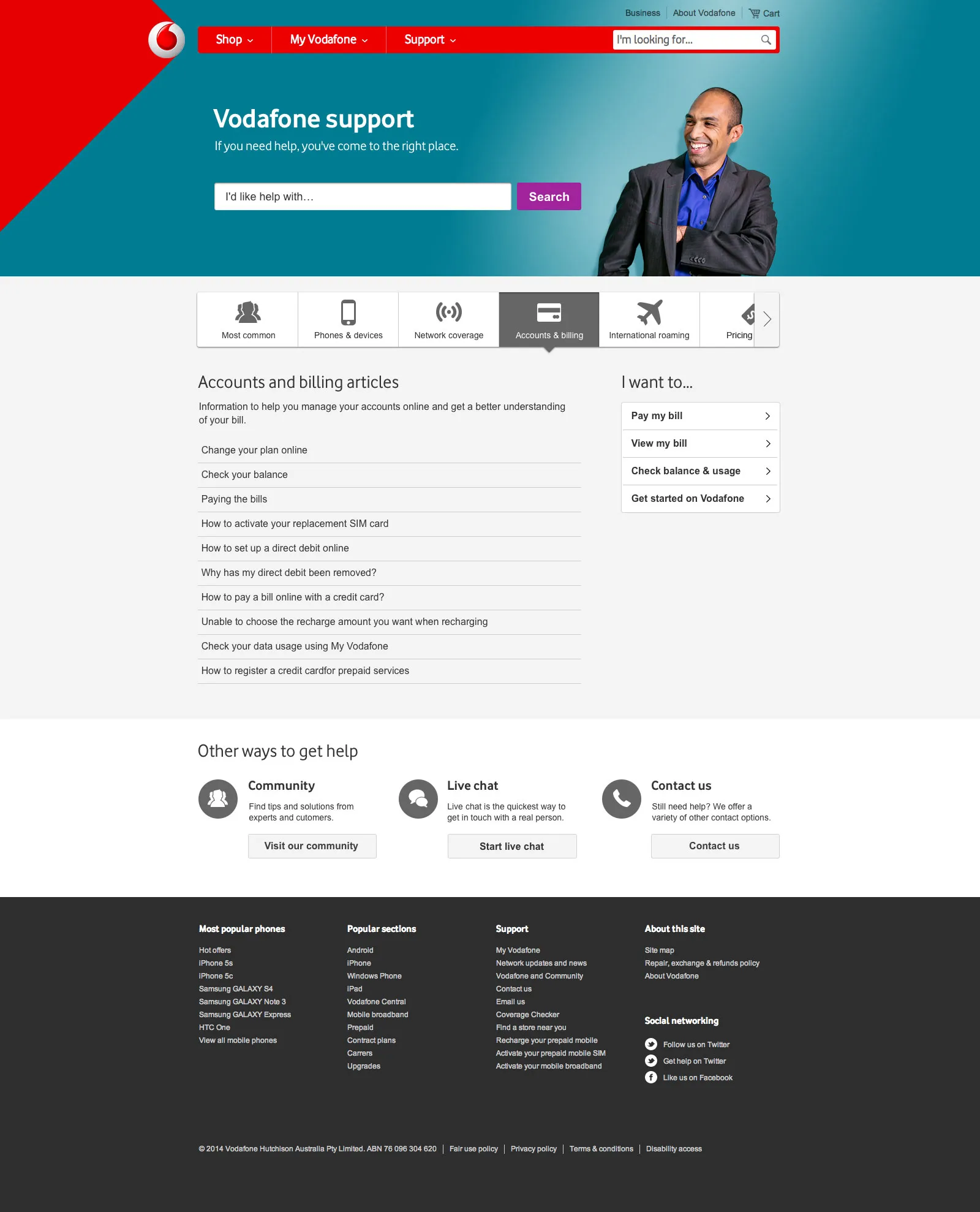
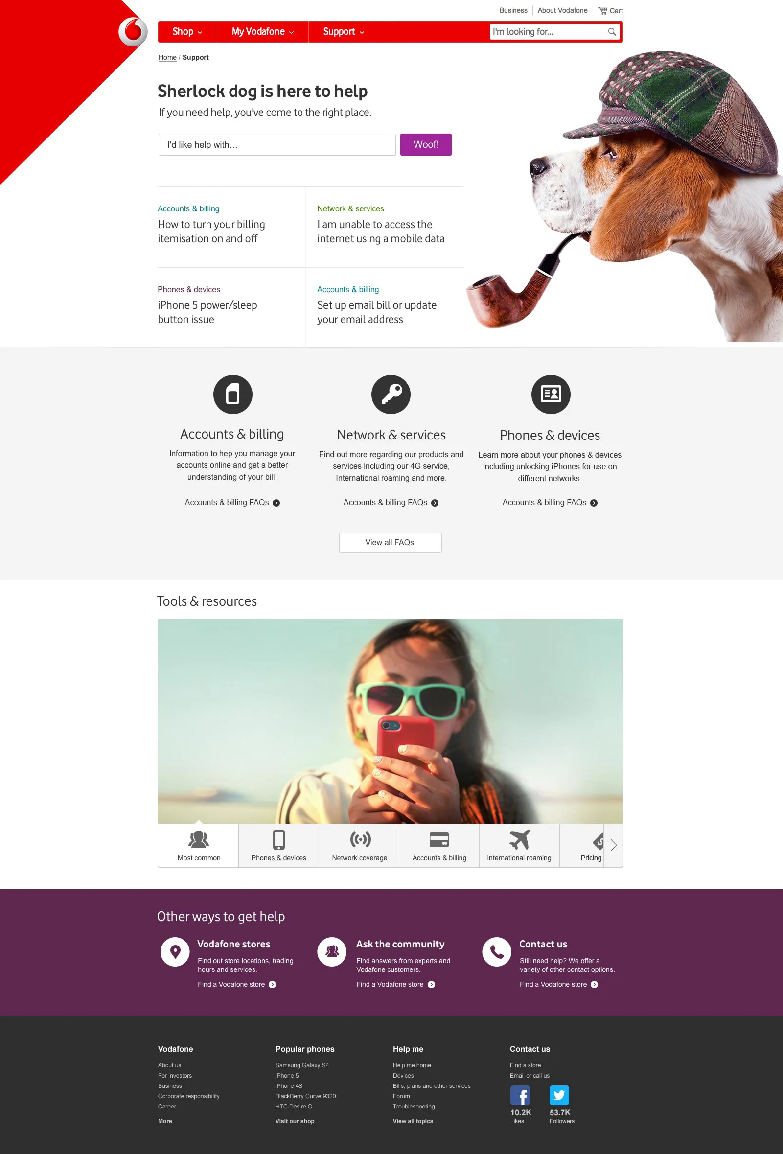
I also developed concepts for the support section. My favourite, a detective dog called Sherlock, didn't make the final cut, however hard I pushed.