Case 01 / 18
Zettle

The challenge
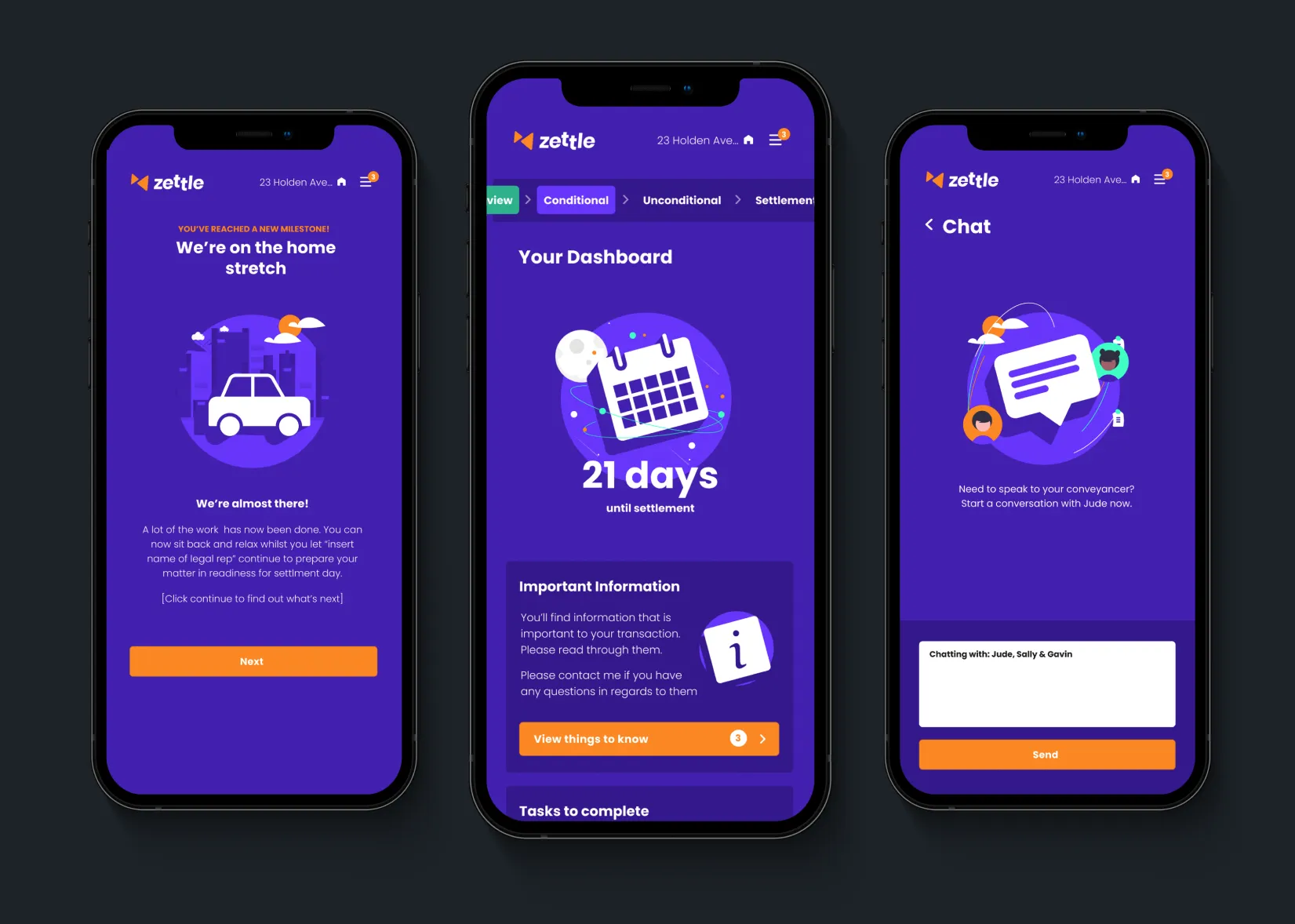
For most people, buying or selling a property is confusing and stressful. There are lots of parties, lots of documents, long waits and very little visibility of what is actually happening. Zettle set out to give everyone involved one place to see where things stand and exactly what they need to do next.
My role
I was the lead designer on Zettle, sitting at the centre of a small, busy team. On one side were the head of product and several marketing managers. On the other were three to four developers. A big part of my job was keeping everyone moving in the same direction.
I was often designing product UI while also delivering on marketing objectives, so I learned to switch between the two quickly without letting either slip. I worked through technical constraints with the developers and, where it helped, took on front end development myself. I also briefed and oversaw a junior designer, keeping their work consistent with the wider system.
I spent much of my final year focused on the marketing and onboarding experience.
Brand first
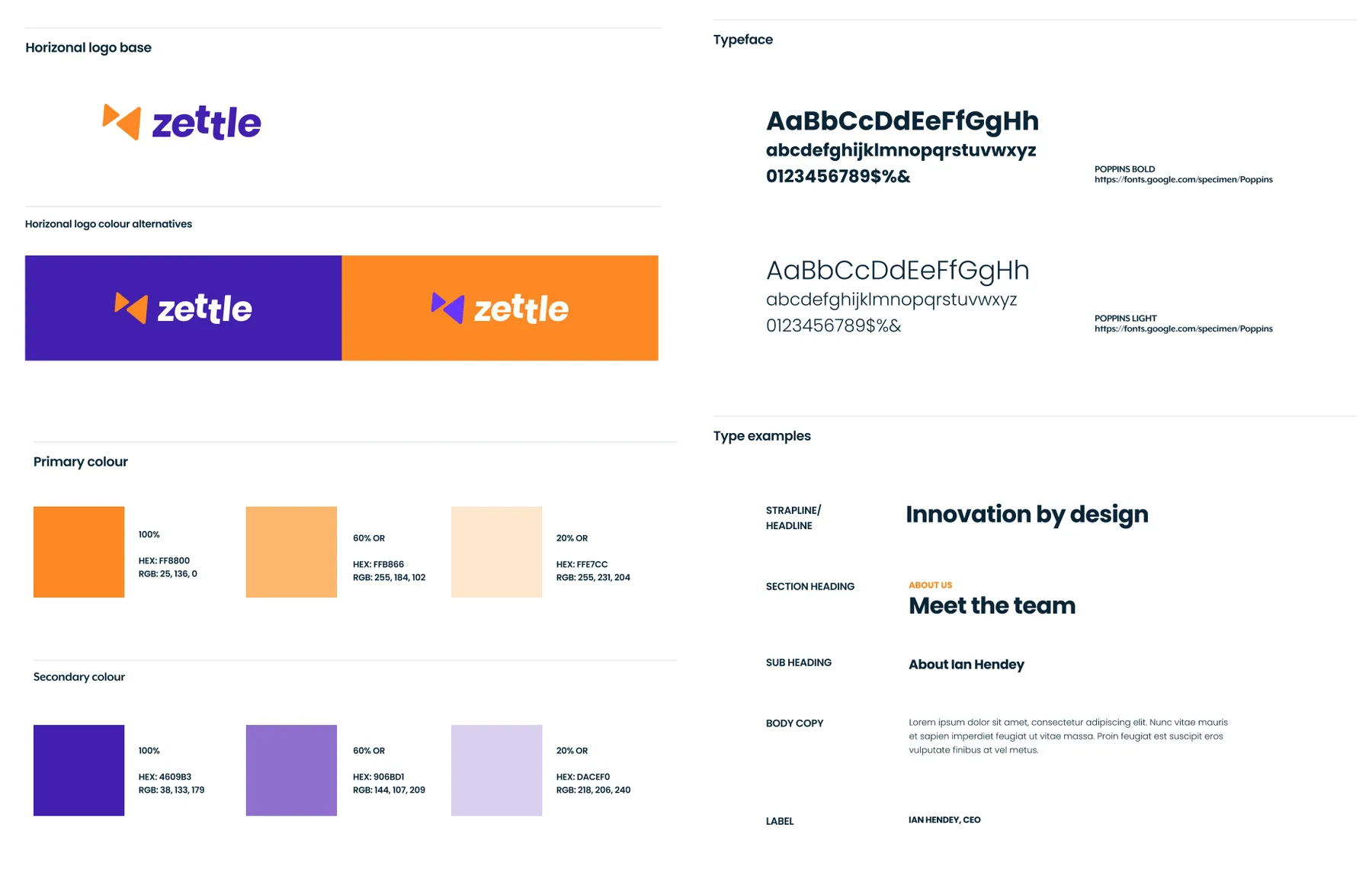
We set the look and feel before designing the product in detail. With the visual language agreed early, the team could focus product conversations on how things should work rather than how they should look.
A friendlier face for conveyancing
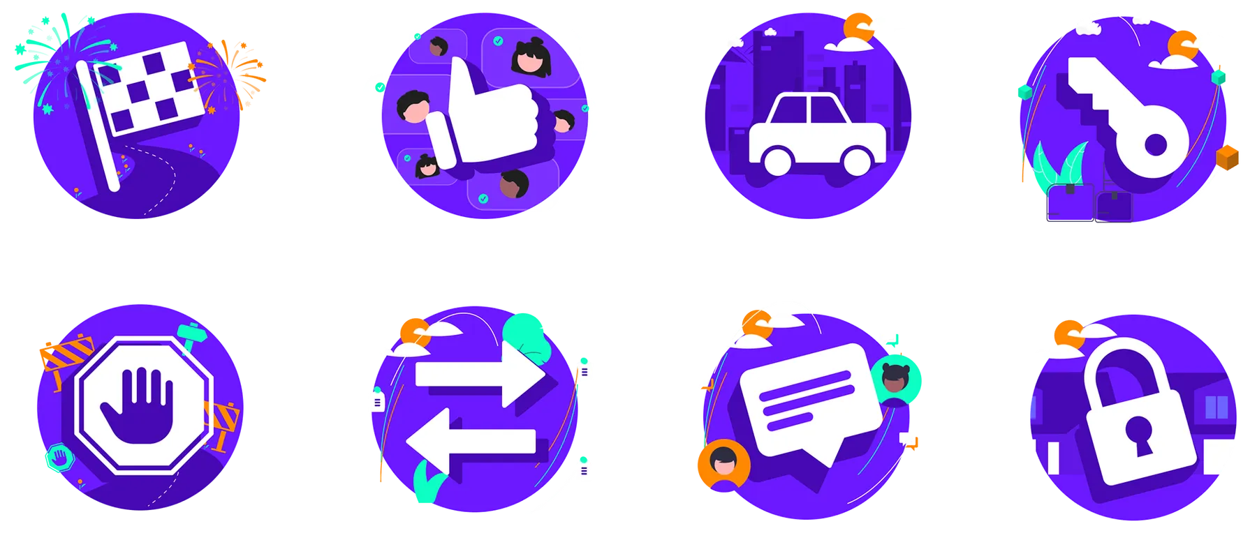
I created a playful illustration style, animated in Lottie, that became a key part of the interface. The idea was to make settlement feel like following a picture book: simple, step by step, and nothing to fear.
Acquisition website
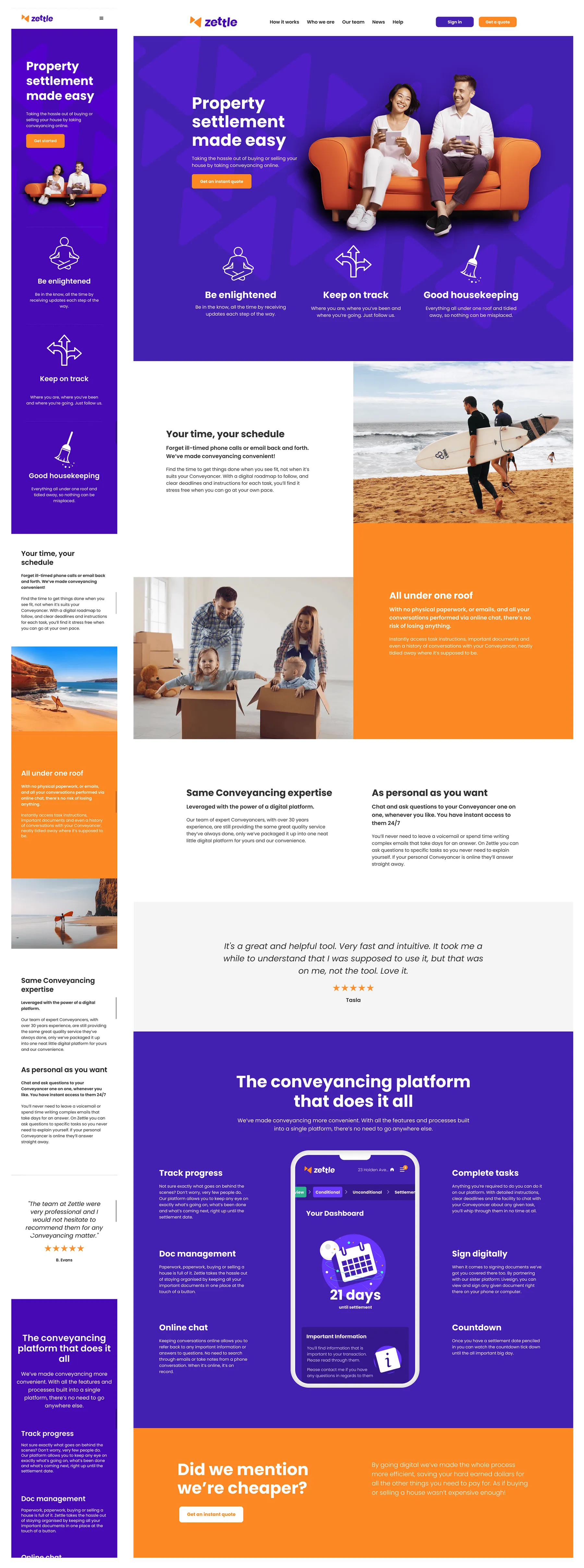
The marketing pages were where I tested type pairings, colour, illustration and photography together. They carry the most personality, which let the product UI stay cleaner and more focused.
Product UI
The product problems were complex, with several parties, many states and lots of edge cases. I kept the work in two streams. First I mapped and tested how each flow should work. Only then did I apply the visual design. Separating the two kept decisions clearer and stopped visual debates from slowing down functional ones.